THE EVOLUTION OF AN INVITE: WELLS BAPTISM
Invitations are a very special part of any event. The invitation is typically a guests first interaction with an event so it is important that it sets the tone of the event (including look and feel) as well as provides all the pertinent information a guest would need.
STARTING THE INVITATION PROCESS:
When working with a client on an invitation, I always start with an event questionnaire which ensures I have a good sense of the needs and aesthetic preferences of the client. I also collect all the copy that the client wishes to be included on their invitations during this step.
However, for this particular occasion I was my own client. This is an event near and dear to my heart as it was created to invite friends and family to the baptism (and post baptism brunch) of my youngest son Wells. I have to admit, that I never did get around to making a birth announcement for Wells like I did for my oldest, Colin, so I thought I needed to step up my mom game for the baptism. Seems fair, right?
DESIGN CONSIDERATIONS:
Below were the key bits of information I considered when designing this invitation:
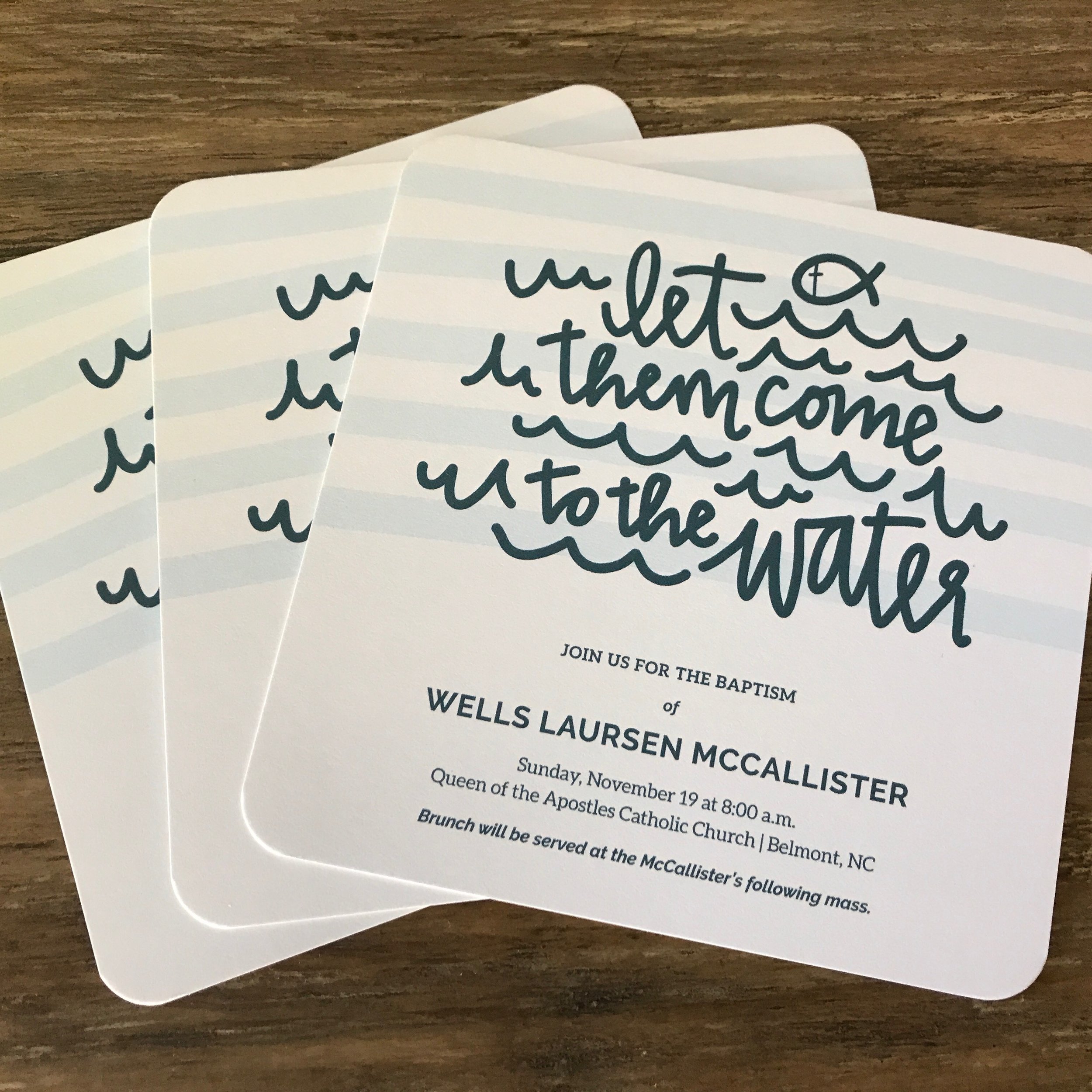
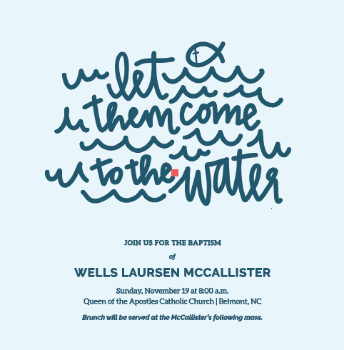
I wanted to use a line from one of my favorite catholic hymns, Let Them Come to the Water.
The invite was being designed to be sent to family and close friends so it could be casual but should still reflect the importance and solemnity of the event as well.
I wanted to use my hand-lettering in some way.
The aesthetic should be clean, crisp and creative.
The color scheme would be blue and white.
I wanted to use a square format. (note: squares always cost $.21 more to ship)
A matching envelope would be designed to coordinate with the invitation.
THE CREATIVE PROCESS:
This is the point where I begin sketching. My ideas often begin quite informally and develop throughout the creative process.
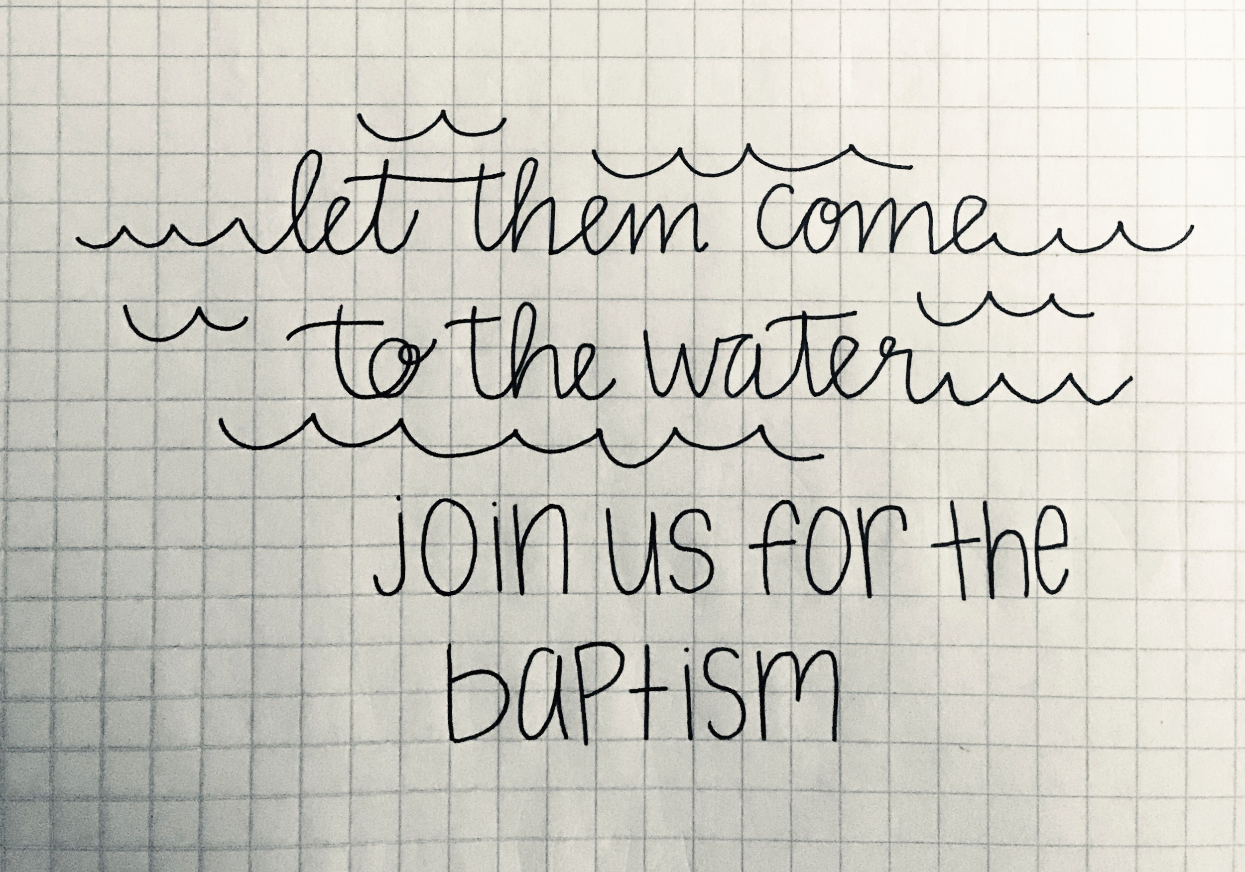
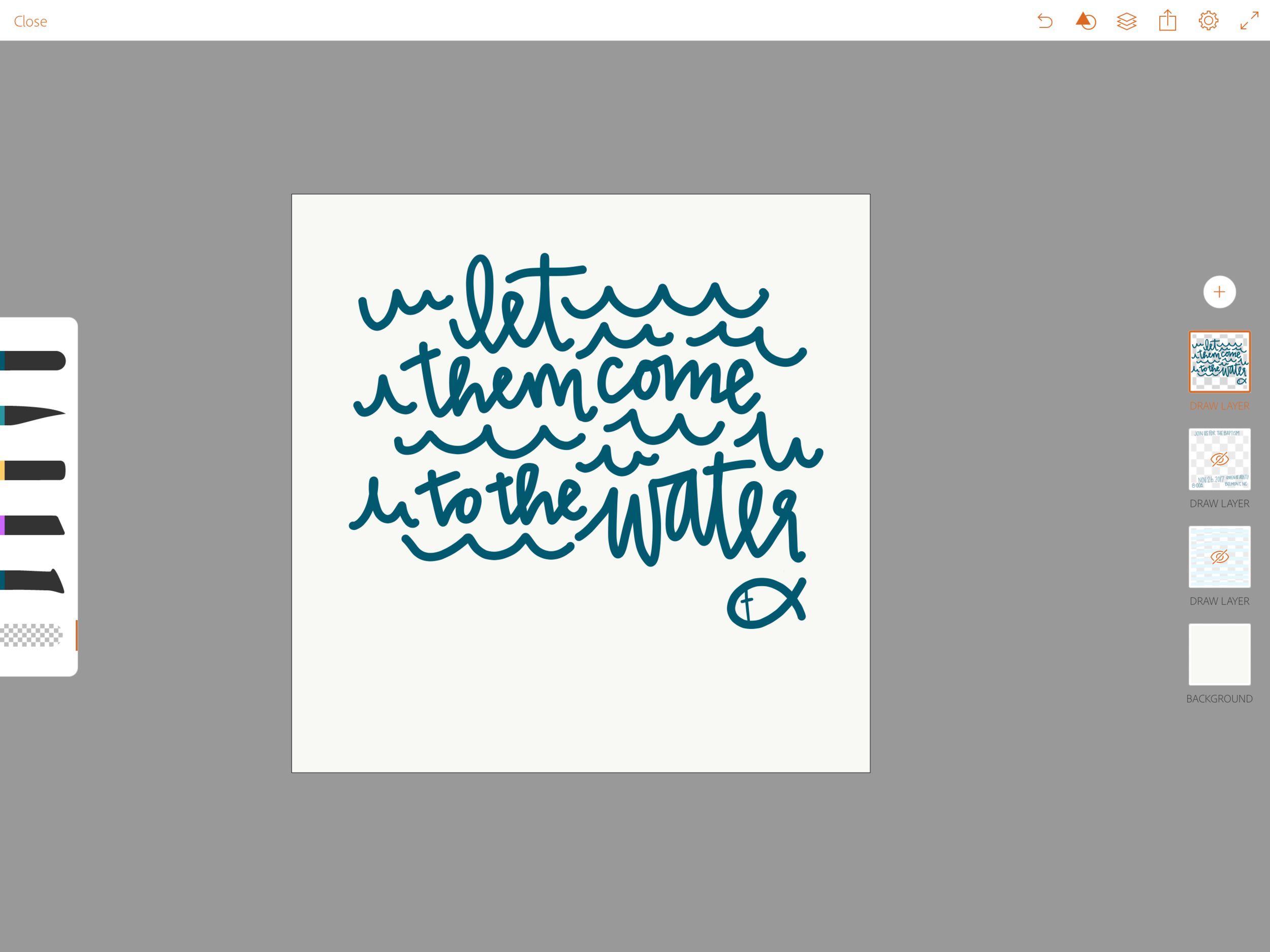
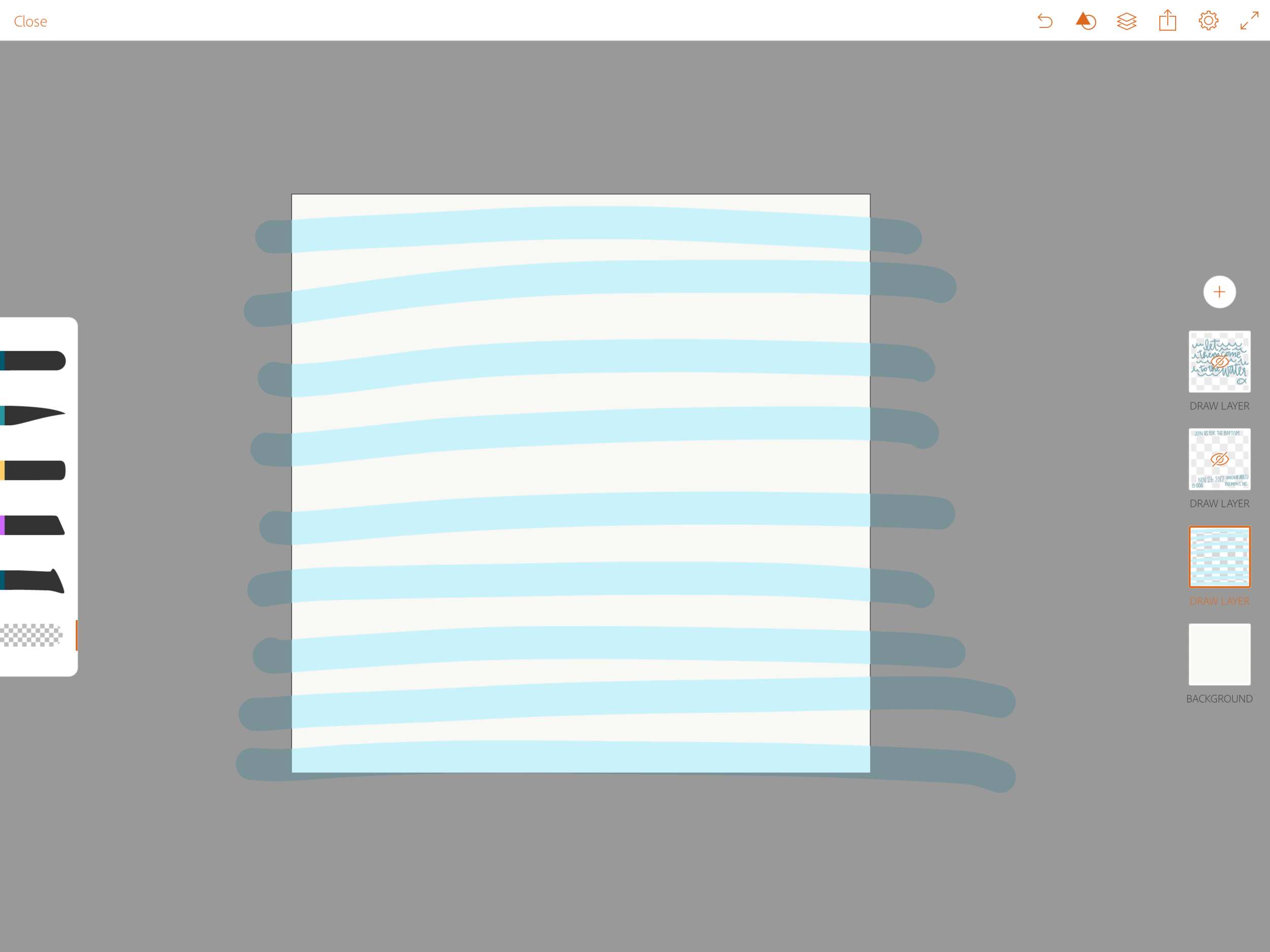
I have been using an iPad Pro with Apple Pencil quite often to assist with digitizing my lettering. Sometimes I will import an image of my sketch and try to trace over it to maintain the integrity of the original idea, but in this instance I drew things freehand in Adobe AI app which allows you to create vector (images that can be scaled to any size) assets that transfer directly into Adobe Illustrator. One thing that I love about creating assets on the iPad Pro is how easy it makes my trial and error process. I have the ability to design in layers as well as easily turn them on and off and quickly undo actions.
I am a bit of a perfectionist when it comes to my hand lettering and illustrations so once the drawing was complete, I went to work on it in illustrator. Below is an image of what was created on my iPad compared to what the final image ended up being. You may have to look closely to see the differences as the are subtle but to me, those subtle details are what really makes a design special.
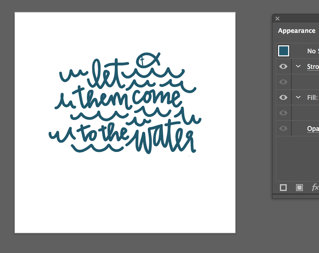
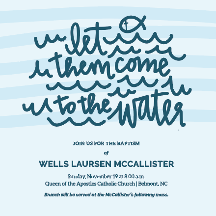
Once the graphic was in a final state I began playing with the layout and type. At first, I created a flat background but the graphic wasn't popping like I had hoped and the graphic and text didn't have any visual separation. To combat this, I created a hand drawn stripe and incorporated it into the composition.
PRINTING AND FINISHING
I used stationeryHQ.com to print these. I highly recommend them to anyone who is printing stationery. They offer wholesale pricing, variable data entry/printing, as well as a high quality print, paper and envelopes. You can even select from a wide range of envelope colors as they offer envelopes from Waste Not Paper (AKA The Paper Source).
So in the end, a lot of work and creativity goes into this seemingly small invite projects but I think you will agree that the outcome is well worth the time and investment. Just look at these cuties!